The Designer lets you restyle roughly 90 elements of this app. This guide is about working in it quickly: finding the right element without scrolling, picking it straight from the page, undoing freely, and using the compact color and value grids. Everything here works on desktop and on phones.If you have never styled anything yet, skim the themes guide first. It explains the element model, light versus dark mode and how a finished look becomes a shareable theme.
Live Designer playground
These are real styled components. Use element search, hover highlighting or Pick from page while a Designer tour is open. Changes stay local to your browser.
Chapter Title example
Every word in this short chapter can become its own styleable span when the Span per word variant is active.
Asafescopedanimationpreviewsonewordatatime
Controls and states
Element
What to inspect
Base Button
Hover, focus and disabled states
Story Image
Object fit and integrated placement
Image and image box
Click the picture to test the full-size image interaction.
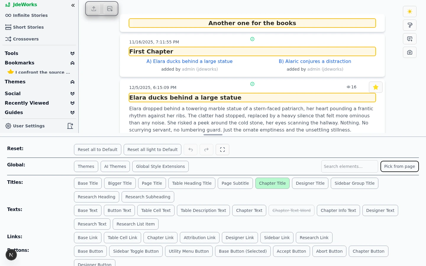
The drawer's top rows are the control center: the Reset row holds the reset buttons plus undo, redo and the fullscreen toggle, and the Global row ends with the element search box and Pick from page. The thin bar above everything drags to resize the drawer.Reset, undo, redo and fullscreen on top, search and Pick from page in the Global row.Type into Search elements... and the picker filters as you type: searching title shrinks the grid to the title elements and their icon. The group headings stay, so you always see where a match lives.The search filters the ~90 element buttons live.Not sure what an element button means? Hover it. Every place that element appears on the live page gets an amber outline. If it is not on the current screen, a small chip tells you so, and app-wide elements say Applies app-wide. Clicking an element also scrolls a live match into view and flashes it briefly, which is the touch equivalent of the hover preview.Hovering an element button outlines where it lives on the page.
Pick from page
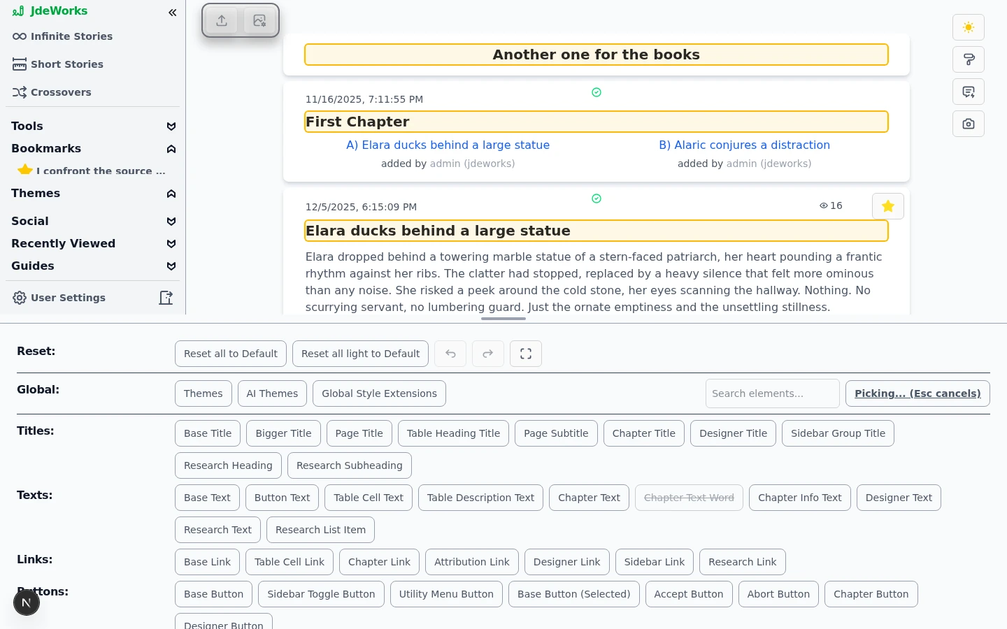
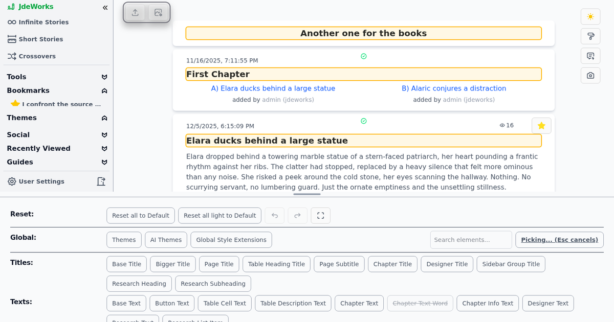
The fastest route goes the other way around: you see something on the page and want to restyle exactly that. Click Pick from page. The button switches to Picking... (Esc cancels), the cursor becomes a crosshair, and moving over the live app outlines the styled element under it. A click selects that element in the Designer without triggering the link or button you clicked on.Move over the page, click what you want to restyle. Esc cancels.
Click Pick from page in the Global row.
Move the mouse over the live app. The element under the cursor gets outlined, innermost element first.
Click it. The Designer jumps straight to that element's settings.
Press Esc (or click the button again) to leave the mode without picking.
Picking works on touch devices too: a tap picks the element under your finger. Spots without a styleable element answer with a short not customizable hint. In fullscreen the button is hidden, since pick mode needs the live page visible next to the drawer.
Undo, redo and the reset buttons
Every styling change lands on an undo stack while the Designer is open. The arrow buttons in the Reset row step backward and forward, and the usual shortcuts work too: Ctrl+Z undoes, Ctrl+Y or Ctrl+Shift+Z redoes (Cmd on Mac). That covers single value clicks, swatch picks and even a full reset.The reset buttons are the bigger hammer. Reset element light to Default (or dark) resets only the selected element in the current mode. Reset all light to Default and Reset all to Default clear the current mode or everything, and both ask for confirmation first, since they wipe every customization. Even then, undo can bring the wiped state back while the Designer stays open.
The undo history lives only as long as the Designer is open. Closing the drawer clears it, so undo what you regret before you close.
Swatches, chips and custom colors
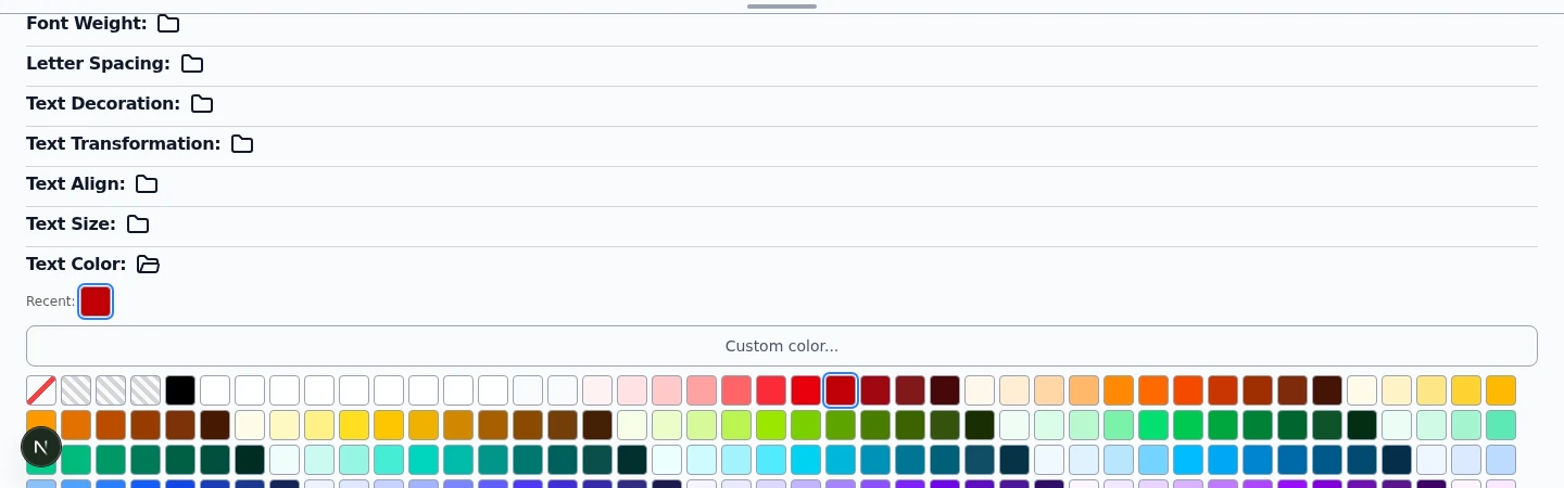
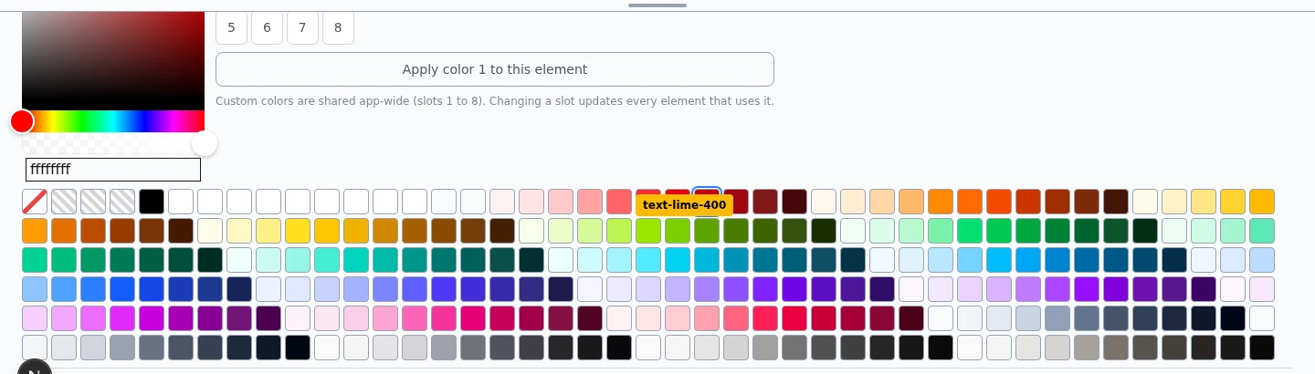
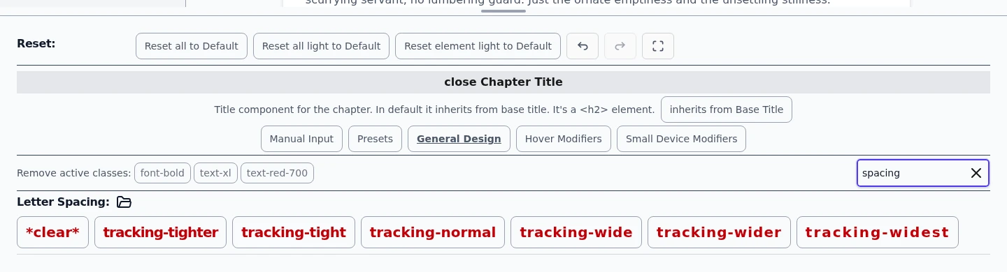
Inside an element, color properties render as compact swatch grids: one tile per allowed color, with a blue ring on the active value and an instant class-name chip when you hover a tile. Colors you used recently collect in a Recent row on top of every color property, shared across all color types. Large numeric properties like paddings and widths render as small value chips instead of full preview buttons.Color properties are swatch grids. The blue ring marks the active value.Custom color... opens a full picker with an alpha slider and a hex input. It edits one of the eight app-wide user color slots, and Apply color N to this element puts that slot's color onto the current property. Since the slots are shared, changing a slot later recolors every element that uses it, which makes them perfect for a theme's accent colors.Custom colors with alpha live in eight shared slots.The Search settings... box next to the Remove active classes row searches within the selected element. It matches property names like spacing, but also concrete values: typing px-4 surfaces Padding X, and typing yellow surfaces every color property with yellow entries. Results open automatically.Setting search finds a property without knowing which group holds it.
Animating chapter text word by word
Chapter text can fade in one word at a time, but it takes two steps and the first one is easy to miss. Select Chapter Text, open its Variant and choose Span per word. That wraps every word in its own span and enables Chapter Text Word in the element list. The word element stays visible but disabled while the Default variant is active, so you can see why it is unavailable.Now select Chapter Text Word and open Manual Input. Click the flask icon next to Css Extensions: it fills in a complete word-by-word fade, keyframes and all, and applying it plays the effect across the chapter. The Designer has no animation control of its own, so this is written CSS by design, and the flask saves you writing it.
Styling is stored separately for light and dark. Author the animation in one mode and the other stays untouched, so switch modes and load the example again there.
The stagger comes from a --word-index variable the app puts on each word span, counting from zero. Change the multiplier in the example's animation-delay to speed the sweep up or slow it down, or swap the keyframes for a slide or a blur - the delay does the same job whatever the animation is.
Resizing, fullscreen and phones
The bar on the drawer's top edge is a drag handle (Drag to resize the Designer). Pull it up for more editing space or down for more live page, between a quarter and three quarters of the screen. The ratio is remembered separately for desktop and phone, so your phone split does not fight your desktop split.The fullscreen button at the end of the Reset row expands the Designer over the whole screen, which is handy for long option lists or Manual Input. Esc or a click outside shrinks it back. Live previews on the page pause in fullscreen because the page is covered.On phones the Designer reorganizes itself: rows stack into a single column, the element buttons shrink, and the Small Device Modifiers section gets an amber ring as a reminder that changes made there target exactly the width you are on. Picking works by tap, and focused inputs scroll above the on-screen keyboard.
Complete Designer reference
Element and setting entries come from the same metadata as the live Designer. Open a section when you need an exact target, prerequisite or example.
Styleable elements (192)
Titles
Base TitleBase title component, most commonly used. In default it's used as template for other titles. It's a <h4> element.
Bigger TitleBigger title component. In default it inherits from Base Title. It's a <h3> element.
Page TitlePage title component. In default it inherits from Base Title. It's a <h1> element.
Table Heading TitleTable heading title component. In default it inherits from base title. It's an <h4> in the <th> element.
Page SubtitlePage subtitle component. In default it inherits from Base title. It's a <h4> element.
Chapter TitleTitle component for the chapter. In default it inherits from base title. It's a <h2> element.
Designer TitleTitle component for the designer. In default it inherits from base title. It's a <h4> element.
Sidebar Group TitleTitle component for the sidebar group. In default it inherits from base title. It's a <h3> element.
Sidebar Brand TitleThe "JdeWorks" brand row at the top of the sidebar. In default it inherits from base title with its own colour. It's a <h4> element.
Research HeadingTop-level heading (#) in a research document. In default it inherits from Base Title and is title-cased. It's an <h2> element.
Research SubheadingSecondary heading (##/###) in a research document. In default it inherits from Base Title. It's an <h3> element.
Texts
Base TextBase text component, most commonly used. In default it's used for other texts. It's a <span> element.
Button TextText in button component. In default it inherits from base text. It's an <span> element.
Table Cell TextTable cell text component. In default it inherits from base text. It's a <span> in the <td> element.
Table Description TextMulti-line description text inside a table cell. In default it inherits from table cell text, removes nowrap, and clamps to three lines. It's a <span> in the <td> element.
Chapter TextText component for the chapter. In default it inherits from base text. It's a <p> element.
Chapter Text WordPer-word span wrapping chapter text, only rendered when Chapter Text's variant is set to Span Per Word. Each span carries a --word-index CSS variable, which is what staggers an effect across the sentence. To animate it you have to write the CSS yourself: a @keyframes plus an animation on [style-element="CHAPTER_TEXT_WORD"] in Css Extensions - the flask icon there loads a working word-by-word fade in one paste. Styling is stored per theme, so light and dark each need it. In default it inherits addStyles from Chapter Text. It's a <span> element.
Chapter Unexplored ChoiceText of an unexplored choice path under a chapter. In default it inherits from base text with tighter spacing than Chapter Text. It's a <p> element.
Chapter Info TextInfo text component for the chapter. In default it inherits from base text. It's a <span> element.
Designer TextText component for the designer. In default it inherits from base text. It's a <span> element.
Research TextParagraph text in a research document. In default it inherits from Base Text. It's a <p> element.
Research List ItemA bullet/numbered list item in a research document. In default it inherits from Base Text. It's a <li> element.
Search HighlightMarks the stretch of text a search query matched, in the Learning dictionary and on the saved-words page. Default is a yellow wash. Keep it to colours: it sits inside running text, so padding or a border would push the line apart. It's a <span> element.
Focus WordUnderlines the word an example sentence is shown for, so a sentence that carries two glossed words still says which one the row is about. Default is a thick underline. It's a <span> element.
Picture Book LineThe read-aloud line on a picture-book page, overlaid on the picture. Sits on top of Picture Book Line Scrim, not inside it, so resizing or repositioning the line never moves its backing. It's a <p> element.
Links
Base LinkBase link component. In default it's used for other links. It's an <a> element.
Table Cell LinkTable cell link component. In default it inherits from base link. It's an <a> in the <td> element.
Chapter LinkLink component for the chapter. In default it inherits from base link. It's an <a> element.
Attribution LinkThe small 'added by <name>' link under each chapter choice. Clicking it opens the find-by-creator search. In default it inherits from Base Link. It's a <span> element.
Designer LinkLink component for the designer. In default it inherits from base link. It's an <a> element.
Sidebar LinkLink component for the sidebar. In doesn't inherit from base link to keep a different design straight forward. It's an <a> element.
Research LinkAn inline link or source link in a research document. In default it inherits from Base Link. It's an <a> element.
Buttons
Base ButtonButton component. In default it's used for other buttons. It's an <button> element.
Sidebar Toggle ButtonThe expand button of a collapsed desktop sidebar. In default it inherits from base button. The phone hamburger is a Top Bar Button since the phone top bar (v0.20). It's a <button> element.
Tutor Launcher ButtonThe fixed bottom-right hand icon that opens the AI Tutor on any Tutor-capable Learning screen. Inherits the Base Button. It's a <button> element.
Fullscreen Reader ButtonThe icon-only controls drawn over the page in the comic/picture-book fullscreen reader (jump to page, exit, hide text, things to find). Default is flat - a bare icon with a little padding, no background or border - so it never overshadows the page. Position it (top/bottom/right, translate) and give it its own colour; one setting moves and recolours every fullscreen reader button at once. It's a <button> element.
Utility Menu ButtonThe ⋯ trigger at the right end of the phone top bar, opening the menu that replaces the utility button stack. In default it inherits from Top Bar Button. It's a <button> element.
Top Bar ButtonEvery icon button in the phone top bar: the menu (hamburger), guide cues, sound and notifications. Default is flat - a 20 px icon in a 44 px round touch area, no border or fill - so the bar stays slim. One change restyles all of them. It's a <button> element.
Base Button (Selected)Persistent selected/toggled state of a base button (active admin tab, toggled filter, chosen mode). It's a <button> element while its option is selected. In default it inherits from base button with a highlight background.
Accept ButtonAccept button component. In default it inherits from base button. It's an <button> element.
Abort ButtonAbort button component. In default it inherits from base button. It's an <button> element.
Chapter ButtonButton component for chapter related actions. In default it inherits from base button. It's an <button> element.
Designer ButtonButton component for designer actions. Intended to be lightweight so it doesn't inherit and has a minimal layout. It's a <button> element.
Icons
Base IconBase icon component. In default it's used for other icons. It's an <svg> element.
Button IconIcon in button component. In default it inherits from base icon. It's an <svg> element.
Page Title IconThe large icon shown next to the page title.
Achievement Card IconThe glyph on achievement, quest and discovery-track cards on the achievements page. Individual glyphs can be swapped app-wide via the Icon Map's per-role overrides.
App Icon SetThe app-wide icon set. Switch the whole app between icon styles (flat, rounded, solid...) and override individual icons.
Story Config
Story Config BadgeBase badge around story config icons. Category badges inherit from this.
Story Config Badge (Genre)Badge around genre config icons. In default it inherits from the Story Config Badge.
Story Config Badge (Tone)Badge around tone config icons. In default it inherits from the Story Config Badge.
Story Config Badge (Theme)Badge around theme config icons. In default it inherits from the Story Config Badge.
Story Config Badge (Age)Badge around age config icons. In default it inherits from the Story Config Badge.
Story Config Badge (Other)Badge around other story config status icons. In default it inherits from the Story Config Badge.
Story Config IconsThe icon chosen for each story config value, for example Genre: Comedy or Tone: Playful.
Inputs
Base InputBase input component. In default it's used for other inputs. It's an <input> element.
Base Text AreaBase Text Area component. In default it inherits from base input. It's a <textarea> element.
Base CheckboxBase Checkbox component. Default variant styling is configured here. If the Switch variant is used, the visible switch styling is configured through Checkbox Switch Track and Checkbox Switch Thumb.
Checkbox Switch TrackTrack (background pill) of Base Checkbox's "switch" variant. Only visible when Base Checkbox's variant is set to Switch. It's a <span> element.
Checkbox Switch ThumbThumb (sliding knob) of Base Checkbox's "switch" variant. Only visible when Base Checkbox's variant is set to Switch. It's a <span> element.
Designer Text AreaText Area component inside the designer for class copy pasting. In default it inherits from base text area. It's a <textarea> element.
Base RadioBase Radio component - the native radio input beneath a BaseRadioOption card (or used standalone). It's an <input type="radio"> element.
Radio GroupContainer for a set of BaseRadioOption cards - carries the group's label and validation-error text. It's a <div role="radiogroup"> element.
Radio Option CardOne tappable option card inside a Radio Group, wrapping a Base Radio and its label text. Its styling parent is Base Text. It's a <label> element.
Tables
TableTable component. It's a <table> element.
Table BodyTable body component. It's a <tbody> element.
Table HeadingTable heading component. It's a <th> element.
Table CellTable cell component. It's a <td> element.
Table Cell SelectedTable cell of a selected/highlighted row. It's a <td> element while its row is selected. In default it inherits from table cell.
Backgrounds & Surfaces
Page BackgroundBackground for the page. It's a <div> element.Accepts color, layout and a background image.
Designer BackgroundBackground for the designer. It's a <div> element.Accepts color, layout and a background image.
Sidebar BackgroundBackground for the sidebar. It's a <div> element.Accepts color, layout and a background image.
Mobile Sidebar DrawerPanel of the slide-in navigation drawer on small devices. In default it inherits from Sidebar Background, is hidden on desktop and shown via the small-device modifier. Remove or adjust those to change where each sidebar appears. It's a <div> element.Accepts color, layout and a background image.
Utility Button BarContainer of the top-right utility buttons (theme, Designer, report, screenshot). In default it is hidden on small devices via the small-device modifier, where the utility menu button takes over. It's a <div> element.Accepts color, layout and a background image.
Phone Top BarThe bar across the top of the screen on small devices holding the menu, sound, notifications and ⋯ buttons. In default it is hidden on desktop and shown via the small-device modifier; it slides away while scrolling down and returns on scrolling up. Its height moves the page content with it. It's a <header> element.Accepts color and layout. It has no background-image action.
Modal BackgroundBackground for the modal. It's a <DialogPanel> element from headless UI.Accepts color, layout and a background image.
Reading Area (Outer)The full-width wrapper around the reading column. Its max-width controls how wide the story reads. It's a <div> element.Accepts color, layout and a background image.
Reading Area (Inner)The padded panel between the reading wrapper and the chapter card. It carries the reading padding, so set it to the setting's backdrop colour. It's a <div> element.Accepts color, layout and a background image.
Content AreaThe main-content wrapper on non-reading pages (tables, search, statistics, lists). Keep it calm and readable. The reading areas cover the immersive story views. It's a <div> element.Accepts color, layout and a background image.
Chapter CardThe card the chapter text sits directly on, the innermost reading surface (e.g. the 'page' the story is printed on). Give it the setting's material colour. It's a <div> element.Accepts color, layout and a background image.
Suggested Themes CardThe card around the suggested-themes section. In default it inherits from Chapter Card. Set Display to hidden to hide the whole section. It's a <div> element.Accepts color, layout and a background image.
Section DividerThin horizontal separator line above sub-sections (comments compose area, theme suggestion controls). Set Display to hidden to remove it. It's a <div> element.Accepts color and layout. It has no background-image action.
Bordered BoxBordered rounded container grouping related content (planned-outline units, social story rows). It's a <div> element.Accepts color and layout. It has no background-image action.
Scene Option RowThe wrapping row of cards below a new story's 'Scenes to Include' picker: one card per selected scene, and inside each, the row of 'Should respect/remember' groups. Row layout on wider screens, one column on phones so nothing is pushed off screen. It's a <div> element.
Character Option RowThe wrapping row of cards below a new story's 'Characters to Include' picker: one card per selected character, and inside each, the row of 'Should respect/remember' groups. Row layout on wider screens, one column on phones so nothing is pushed off screen. In default it inherits from Scene Option Row. It's a <div> element.
Help CalloutAccent-colored tip/warning/info box on help pages. In default it inherits from the Bordered Box with an amber accent. It's a <div> element.Accepts color and layout. It has no background-image action.
Comment Reply RailContainer of a nested comment reply with the vertical rail line on the left. It's a <div> element.Accepts color and layout. It has no background-image action.
Comic Choice BarThe panel of onward choices that ends a comic chapter - it fades in over the last page (inline and in fullscreen) as the branching 'what happens next' bar. It's a container div.
Picture Book Line ScrimThe dark backing behind a picture-book page's read-aloud line, sized to the line rather than the whole picture. A sibling of Picture Book Line, not its parent, so dimming or resizing the scrim never fades or moves the text. It's a <div> element.
Dropdowns
Dropdown ButtonButton component for the dropdown. In default it inherits from base button. It's a headless UI <MenuButton> element.
Dropdown PanelBackground of the dropdown options. It's a headless UI <MenuItems> element.
Dropdown ItemItem of the Dropdown. It's a <button> inside the headless UI <MenuItem> element.
Dropdown Delete Item ButtonDelete button inside a dropdown item. It's a <div> element.
Images
Floating Image BoxThe floating (overlaid) frame around the story image. Its inline twin is the Inline Image Box. The image display setting picks which one shows per device.
Floating Short Story Image BoxThe floating (overlaid) frame around short story images. Its inline twin is the Inline Short Story Image Box. The image display setting picks which one shows per device.
Floating Character Image BoxThe floating (overlaid) frame around character and scene images. Its inline twin is the Inline Character Image Box. The image display setting picks which one shows per device.
ImageThe default image element. It is used for story, character and scene images and theme thumbnails. Inline placements use the Inline Image twin instead. It's an <img> element.
Inline Image BoxInline (non-floating) container for the story image in inline placement.
Inline Short Story Image BoxInline (non-floating) container for short story images in inline placement.
Inline Character Image BoxInline (non-floating) container for character/scene images in inline placement.
Inline ImageImage shown inline in the content when the image display setting uses an inline placement. It's an <img> element.
Comic Page ImageThe comic reader's page image. Clicking it opens the same built-in fullscreen every image uses, with prev/next page controls and (at a chapter's end) its choices. It's an <img> element.
Other
TooltipA tooltip component that displays information on hover.
Theme Card BadgeBase badge on theme cards (creator's pick, AI, blocked). The specific badges inherit from this. Set Display to 'hidden' to hide all of them.
Creator's Pick BadgeThe "creator's pick" badge on theme cards. In default it inherits from the theme card badge. Set Display to 'hidden' to hide it.
AI Theme BadgeThe "AI" badge on AI-generated theme cards. In default it inherits from the theme card badge. Set Display to 'hidden' to hide it.
Blocked BadgeThe "blocked" badge shown to a theme's creator on their own blocked themes. In default it inherits from the theme card badge. Set Display to 'hidden' to hide it.
Wizard Step Chip (Done)The fan-fiction wizard's named step crumb once that step is finished (border and text colour only). It's a <div> element.
Learning
Learning BoxBordered container used across the Learning area (language cheat sheets, course cards). In default it inherits from the Bordered Box, so restyling it recolors every learning surface at once. It's a <div> element.Accepts color and layout. It has no background-image action.
Configure Session ButtonThe button in the Learning session header that opens the session setup (modules, AI features, answer style). In default it inherits from Base Button with a gear icon and an accent border and tint, so it reads as the entry to setup rather than another toggle. It's a <button> element.
Session Setup FooterThe Cancel and Start session row at the bottom of the Learning session setup panel. In default it stays pinned to the bottom of the screen while the long setup list scrolls behind it. It's a <div> element.
Glossed Reading WordA word (or short phrase) in the Reading module that carries a vocabulary gloss - clicking it opens the explanation tooltip. Rendered only for the bounded set of annotated words visible at the reader's current level filter, never the whole passage. In default it inherits from Chapter Text Word plus a dotted underline and pointer cursor. It's a <span> element.
Static Gloss WordA function word (article, conjunction, pronoun, preposition) in the Reading module whose gloss comes from the language's own fixed table rather than from the passage. Same tooltip as Glossed Reading Word, deliberately quieter: in default it inherits that element with a thinner underline, so the passage's real vocabulary keeps the stronger mark. It's a <span> element.
Course Progress TrackThe background track of the course-level progress bar (Learning session screen). In default it's a thin rounded bar. It's a <div> element.
Course Progress FillThe filled portion of the course-level progress bar; its width is computed from completed/total modules and passed in by the caller (not Designer-editable - a data-driven value, not a themeable one). In default it's a colored rounded bar. It's a <div> element.
Gap Blank InputThe free-form typed blank inside a gap-text exercise, and the SRS review screen's typed-recall input. In default it inherits from Base Input, sized inline by the caller for the expected answer length. It's an <input> element.
Gap Blank (Correct)A checked gap control with a correct verdict. It inherits the Gap Blank Input dimensions and adds a fixed semantic green treatment. It's an <input> or compact <span> element.
Gap Blank (Incorrect)A checked gap control with an incorrect verdict. It inherits the Gap Blank Input dimensions and adds a fixed semantic red treatment. It's an <input> or compact <span> element.
Choice ChipA tappable answer option before it's been checked (a TFNG True/False/Not Given row, a matching-pair tile, a reorder card, an SRS grade button). It owns its chip shape and interaction states. Its styling parent is Base Text. It's a <button> element.
Exercise Answer (Selected)A choice chip's chosen-but-not-yet-checked state. Its styling parent is Choice Chip, and it changes the selection treatment. It's a <button> element while its option is selected.
Exercise Answer (Correct)Post-check feedback for a right answer (a correctly selected option, or a correctly filled gap). In default it's a green button, the same shape as the Accept Button. It's a <button> element. The semantic green hue is fixed and not Designer-editable; shade, opacity and shape are.
Exercise Answer (Incorrect)Post-check feedback for a wrong answer. In default it's a red button, the same shape as the Abort Button. It's a <button> element. The semantic red hue is fixed and not Designer-editable; shade, opacity and shape are.
Exercise Answer (Revealed)Post-check feedback for the correct answer the learner missed, shown once the verdict reveals it (an unselected-but-faulty word in error finding, the real branch in prediction). In default it's an amber button, the same shape as Base Button. It's a <button> element. The semantic amber hue is fixed and not Designer-editable; shade, opacity and shape are.
Error-Find Marked WordThe word you've marked as 'I think THIS one is wrong' in an error-finding exercise, before submitting. In default it inherits from Chapter Text Word plus a red wavy underline and a subtle red tint. It's a <span> element. Unlike the post-check feedback states, its hue IS Designer-editable - it's your own working mark, not a verdict.
Error-Find Word (Correct)A word correctly marked as an error. It stays inline with a fixed green wavy underline. It's a <span> element.
Error-Find Word (Incorrect)A word incorrectly marked as an error. It stays inline with a fixed red-orange wavy underline. It's a <span> element.
Error-Find Word (Revealed)A missed error revealed after grading. It stays inline with a fixed amber double underline. It's a <span> element.
Count BadgeThe small count pill, e.g. the due-words badge on the Learning start screen. In default it's a red circle with white text. It's a <span> element. Set Display to 'hidden' to hide it.
Reorder Placed RowOne already-placed sentence in the reorder module's ordered list, before it's graded. In default it's plain, vertically centered text - not a button, unlike Choice Chip which the pool (unplaced) rows still use. After grading it renders through the same Exercise Answer (Correct)/(Incorrect) state swap as every other exercise answer, so a placed row still turns green or red. It's a <span> element (rendered as a <button>-free container).
Flash CardA flash card's front/back face and the vocabulary test's picture tile. Restyling border, radius or shadow here restyles all of them at once. It's a <div> element.Accepts color and layout. It has no background-image action.
Flash Card Topic TileOne topic you can pick before a vocabulary test on the flash-card screen (Family, Fruits, all of level A1), carrying its name and how many cards it holds. In default it inherits the Base Button and stretches to fill its grid cell. It's a <button> element.
Flash Card Test HeaderThe slim strip above a running vocabulary test: the card count, the progress bar and the Quit action. It is the only chrome on screen while the test runs. The bar inside it is the Course Progress Track and Fill pair. It's a <div> element.Accepts color and layout. It has no background-image action.
Learning Inline Error TextA standalone error or refusal line on a Learning screen - a failed module submit's retry prompt, or a per-chapter visibility-change refusal. In default it's red text. It's a <span> element.
Annotation Translation LineThe quiet line under a sentence in a grammar course's annotated reading when 'Show translation' is on. In default it inherits from Base Text, set small and in italics, and one step smaller on phones. It's a <span> element.
Course Continuation ButtonThe course page's 'Keep going' continuation buttons (continue into the next chapter's course, create one there, or pick a story choice). In default it inherits from Base Button, full width with wrapping text on phones so a long story choice never runs past the card. It's a <button> element.
Course Continuation Button TextThe label text inside a Course Continuation Button. In default it inherits from Button Text, wrapping onto multiple lines on phones instead of overflowing. It's a <span> element.
Groups
Group Label Chip (Original)The bordered chip a group's header shows for the Original label (GroupChip.tsx, groupLabels.ts). It's a <span> element.
Group Label Chip (Public Domain)The bordered chip a group's header shows for the Public Domain label. It's a <span> element.
Group Label Chip (Fan Fiction)The bordered chip a group's header shows for the Fan Fiction label. It's a <span> element.
Group Chip (Neutral)GroupChip's default tone: a plain bordered chip (request states, counts). It's a <span> element.
Group Chip (Warning)GroupChip's warning tone ('Invite only', a pending request). It's a <span> element.
Group Chip (Danger)GroupChip's danger tone ('Hidden while under review'). It's a <span> element.
Group Chip (Info)GroupChip's info tone. It's a <span> element.
Brief Row New MarkThe small 'new' pill next to a just-added or just-accepted brief entry (BriefEntryRow.tsx's NewMark). It's a <span> element.
Brief Depth Badge (Full)A brief character row's Develop-depth badge when the entry is fully developed. It's a <span> element.
Brief Depth Badge (Developed)The Develop-depth badge for a partially developed entry. It's a <span> element.
Brief Depth Badge (Summary)The Develop-depth badge for a summary-only entry. It's a <span> element.
Brief Row Flagged MarkThe safety-flag mark on a brief row the moderation check held (BriefEntryRow.tsx, moderators/admins only). It's a <span> element.
Brief RowA brief entry row's own bottom divider (BriefEntryRow.tsx, BriefSuggestionsPanel.tsx's MineRow). It's a <div> element.
Brief Row (Just Added)Brief Row's variant for a just-added or just-accepted entry: the same divider plus a quiet tint. It's a <div> element.
Brief Row (Selected)Brief Row's variant for the currently selected text row: the same divider plus a focus ring. It's a <div> element.
Brief Row (Just Added + Selected)Brief Row's variant for the rare case a just-added row is also the selected one: divider, tint and ring together. It's a <div> element.
Brief Budget Meter ContainerThe bordered box around the 'room for characters' budget meter (BriefBudgetMeter.tsx). In default it inherits from Bordered Box. It's a <div> element.
Brief Budget Meter TrackThe budget meter's background track. In default it inherits from Course Progress Track. It's a <div> element.
Brief Budget Meter Fill (OK)The budget meter's fill while usage is under 80 percent. It's a <div> element. The semantic green hue is fixed and not Designer-editable; shade and opacity are.
Brief Budget Meter Fill (Warning)The budget meter's fill from 80 percent up to the limit. It's a <div> element. The semantic amber hue is fixed and not Designer-editable; shade and opacity are.
Brief Budget Meter Fill (Over Limit)The budget meter's fill once usage is over the limit (the same numbers the server's 422 uses). It's a <div> element. The semantic red hue is fixed and not Designer-editable; shade and opacity are.
Brief Budget Meter Over-Limit LabelThe budget meter's percentage label once usage is over the limit. It's a <span> element.
Brief Note (OK)briefUi.tsx's coloured status note, OK tone (left-rule box). It's a <div> element.
Brief Note (Info)briefUi.tsx's coloured status note, info tone. It's a <div> element.
Brief Note (Amber)briefUi.tsx's coloured status note, amber/warning tone. It's a <div> element.
Brief Note (Error)briefUi.tsx's coloured status note, error tone. It's a <div> element.
Brief Warning TextA standalone warning line in the brief panel or its suggestions list (a conflict notice, a held-suggestion note). It's a <span> element.
Brief Error TextA standalone error line in the brief panel (a validation message). It's a <span> element.
Brief Diff HighlightThe changed-word highlight inside a brief diff (BriefEntryEditor.tsx, BriefSuggestionsPanel.tsx). It's a <mark> element.
Group Character Invented TagThe small tag marking a field a Develop call invented rather than found in the source work (InventedTag.tsx). It's a <span> element.
Version Field TagA character version's per-field state pill - "From the base", "Changed in this version", "Checked, same as the base" or "Not updated for this moment" (VersionFieldState.tsx). It's a <span> element.
Version Field Added Tag"Added in this version" - a field or group the base character does not have at all (VersionFieldState.tsx). It's a <span> element.
Version Add-Field BoxThe dashed container the "Add a field"/"Add a group" form opens inside, in a character version's builder (VersionAddField.tsx). It's a <div> element.
Specials & Admin
Modal BackdropThe dimmed scrim behind a dialog panel (PictureBookLanguageModal.tsx, BaseModal.tsx, GuestStoryWall.tsx, PrintExportModal.tsx, PassageRewriteModal.tsx, LearningDictionaryAction.tsx). It's a <div> element.
JSON Preview BlockA monospace <pre> block previewing raw JSON (ReviewQueueRows.tsx's copyright-claim/NSFW-info/AI-feedback payloads, SpecialRosterScreen.tsx's appearance-sheet preview). It's a <pre> element.
Secondary Meta TextA small muted info line (ReviewQueueRows.tsx's per-row meta line, GroupsPanel.tsx's group meta/empty-state text, SpecialRosterScreen.tsx's roster labels). It's a <span> element.
Special Kind Badge (Comic)The browse table's and start page's kind badge for a Comic special (SpecialsTable.tsx's KindBadge, helper.ts). It's a <span> element.
Special Kind Badge (Choice Images)The kind badge for a Choice Images special. It's a <span> element.
Special Kind Badge (Audiobook)The kind badge for an Audiobook special. It's a <span> element.
Special Kind Badge (Scored Reading)The kind badge for a Scored Reading special. It's a <span> element.
Special Kind Badge (Picture Book)The kind badge for a Picture Book special. It's a <span> element.
Special Status Badge (Draft)SpecialsTable.tsx's StatusBadge in the Draft state. It's a <span> element.
Special Status Badge (Published)StatusBadge in the Published state. It's a <span> element.
Special Status Badge (Ended)StatusBadge in the Ended state. It's a <span> element.
Special Status Badge (Archived)StatusBadge in the Archived state. It's a <span> element.
Special Badge (Neutral)The shared neutral badge: VersionBadge's comic-version chip, RosterEntryCard's kind tag (CHARACTER/SCENE), and the kind/status badges' own fallback for an unrecognized server value. It's a <span> element.
Special Roster CardRosterEntryCard's bordered container on the public roster page. In default it inherits from Section Box. It's a <div> element.
Special Roster Variant DividerThe left-rule divider in front of a roster character's outfit/object variant sheets (SpecialRosterScreen.tsx's RosterVariantBlock). It's a <div> element.
Comic Placeholder BorderThe border on a comic page's loading/error placeholder box, shared by ComicChapterChoices.tsx's branch thumbnail and ComicPageContent.tsx's own placeholder. It's a <div>/<span> element.
Special Image Placeholder BackgroundRosterEntryCard's thumbnail-slot fill colour when no reference image exists yet. It's a <div> element.
Comic Version Card (Selected)OrderComicVersionSection.tsx's ring around the currently-selected comic version card. It's a <div> element (Section Box).
Special Bookmark Icon (Active)SpecialBookmarkButton.tsx's filled-favorite icon once a bookmark exists for the current chapter.
Admin Row BoxThe bordered row container shared by GroupsPanel.tsx's GroupRow and ReviewQueueRows.tsx's issue/claim/comment/feedback rows. In default it inherits from Section Box. It's a <div> element.
Admin Warning IconThe small warning glyph on a group's block warning (GroupsPanel.tsx).
Admin Warning TextThe group block-warning's message text, next to Admin Warning Icon. It's a <span> element.
Admin Error TextGroupsPanel.tsx's load-failure message ('Groups could not be loaded.'). It's a <span> element with role="alert".
Visible styling settings (65)
Text
Font Weight116 element targets. 9 values.font-thin · font-extralight · font-light · font-normal
Letter Spacing116 element targets. 6 values.tracking-tighter · tracking-tight · tracking-normal · tracking-wide
Text Decoration116 element targets. 17 values.underline · line-through · no-underline · decoration-dotted
Text Transformation116 element targets. 5 values.uppercase · lowercase · capitalize · normal-case
Text Align116 element targets. 4 values.text-left · text-center · text-right · text-justify
Text Size121 element targets. 14 values.text-[10px] · text-xs · text-sm · text-base
Text Color127 element targets. 255 values.text-inherit · text-current · text-transparent · text-black
Text Font111 element targets. 12 values.font-sans · font-serif · font-mono · font-roboto
Text Line Height116 element targets. 22 values.leading-none · leading-tight · leading-snug · leading-normal
Text Wrap111 element targets. 10 values.whitespace-normal · whitespace-nowrap · whitespace-pre · whitespace-pre-line
Text Shadow111 element targets. 6 values.text-shadow-2xs · text-shadow-xs · text-shadow-sm · text-shadow-md
Text Shadow Color103 element targets. 255 values.text-shadow-inherit · text-shadow-current · text-shadow-transparent · shadow-black
Border color and style need a border width. Shadow colors need their matching shadow. Ring color and inset need a ring width. Transition duration and timing need a transition property. The Designer dims these dependent rows as guidance while keeping them selectable.
Sections and state modifiers (9)
Manual InputEdit classes, CSS extensions, inline style overwrite and parsed configuration. Available for 192 grouped elements.
PresetsBrowse built-in or community styles for the selected element and save a reusable preset. Available for 192 grouped elements.
General DesignConfigure the selected element's ordinary text, border, layout, shadow, display, transition and other settings. Available for 190 grouped elements.
Hover ModifiersApply values only while a pointer hovers the element. Available for 190 grouped elements.
Checked ModifiersApply values to checked checkboxes and switch variants. Available for 6 grouped elements.
Disabled ModifiersApply values while supported controls are disabled. Available for 26 grouped elements.
Focus ModifiersApply values while buttons, links or fields hold keyboard focus. Available for 30 grouped elements.
Active ModifiersApply values while a supported control is being activated. Available for 30 grouped elements.
Small Device ModifiersApply values at the app's phone-width breakpoint. Available for 190 grouped elements.
Structural variants (2)
Base CheckboxDefault · Switch enables Checkbox Switch Track, Checkbox Switch Thumb
Chapter TextDefault · Span per word enables Chapter Text Word
Application icon packs (8)
Flat (Tabler)
Rounded (Phosphor)
Duotone (Phosphor)
Solid (Phosphor)
Minimal (Lucide)
Neutral (Remix)
Solid (Remix)
Solid (Heroicons)
Application roles are grouped into controls, navigation, status, social, security, media, story and analysis areas. Story configuration uses the separate groups below.
Genre (40)
Tone (21)
Theme (17)
Age (7)
Manual, image, theme and AI mechanisms (39)
ClassesVariants, CSS, and animationAdds allowed utility classes to one element while keeping its inherited styling.Example: Give Chapter Title tracking-wide and text-blue-600.
CSS ExtensionsVariants, CSS, and animationAdds scoped CSS, including selectors and keyframes, for one element.Example: Animate Chapter Text Word with word-fade-in and --word-index delays.
Styling OverwriteVariants, CSS, and animationOverrides inline CSS properties using JSON or declaration syntax.Example: Use { "display": "inline-block" } or display: inline-block;.
Current and preview configVariants, CSS, and animationShows the stored element configuration beside the parsed result before Apply Changes writes it locally.Example: Compare a pasted declaration with the generated addStyles object first.
Global CSSVariants, CSS, and animationApplies custom CSS across the app. Broad selectors can cover controls or load remote resources, so review them carefully.Example: Define @keyframes once, then reference it from a scoped element extension.
Eight shared colorsVariants, CSS, and animationStores reusable CSS variables in Global Style Extensions. Changing one slot updates every element that uses it.Example: Use --user-color-1 as the accent for links, buttons and focus rings.
Image-capable backgroundsBackgrounds and imagesOnly explicit background targets accept a background image. Other surfaces still support color, spacing and layout controls.Example: Page Background accepts an image. Section Box is a color and layout surface.
Pexels searchBackgrounds and imagesSearches after two characters, supports three orientations and returns five attributed photos per page for up to six pages.Example: Search forest, choose landscape, then keep the photographer credit with the theme.
Direct image URLsBackgrounds and imagesLoads from a third-party host. That host receives a request and may reject it through access rules or security policy.Example: Use a controlled HTTPS asset and verify it in both light and dark mode.
Floating and inline imagesBackgrounds and imagesFloating boxes overlay the reading area. Integrated twins render inside the reading column, with placement chosen per device.Example: Style Story Image and Integrated Story Image so either reader preference looks intentional.
Object fitBackgrounds and imagesControls how an image fills its box without changing the source image.Example: Use cover for a full crop or contain when every edge must remain visible.
Application icon mapApplication and story iconsSelects one pack for semantic app roles, then allows an override on any individual role.Example: Choose Phosphor Duotone globally and keep Save as its built-in Tabler glyph.
Icon sourcesApplication and story iconsAn override can use a built-in glyph, HTTPS URL, sanitized SVG, Unicode character or emoji.Example: Paste U+1F4BE for Save, or use a script-free SVG with no unsafe links.
Remote icon privacyApplication and story iconsA URL icon contacts its host when rendered and may be blocked. SVG input is sanitized before display.Example: Prefer a built-in role or pasted safe SVG when the icon must work offline.
Story configuration iconsApplication and story iconsGenre, Tone, Theme and Age entries have a base icon plus an optional overlay independent of the app icon pack.Example: Give a Space Opera genre a rocket base icon and a small star overlay.
Theme differencesThemes, presets, and sharingA saved theme contains only values that differ from the defaults for its chosen mode.Example: Change Page Background and Chapter Text, then inspect those two rows before saving.
Save and sharing controlsThemes, presets, and sharingName, description, preview and visibility are stored on the server. Public sharing requires the Terms confirmation.Example: Save privately first, test the preview, then publish from Edit Theme when ready.
Find themesThemes, presets, and sharingSearches by theme or creator and supports Mine, Favorites, filters and sorting.Example: Filter to Favorites, sort by recently updated, then inspect image credits before applying.
Apply, favorite and cloneThemes, presets, and sharingApply changes local styling. Favorite changes your account list. Clone creates a private server copy you own.Example: Preview with Apply before cloning a community theme you want to edit.
Ownership and trustThemes, presets, and sharingOwners can edit or delete. Other users can report public themes. Image credits identify external photography.Example: Open the credits before adopting a photo-heavy theme, and report unsafe content from its card.
Element presetsThemes, presets, and sharingA preset stores one element. Community theme rows can offer both Use Preset and Use Theme.Example: Reuse one Chapter Title style without replacing the rest of your current theme.
Story and chapter suggestionsThemes, presets, and sharingA saved theme can be suggested for reading context. Reader settings decide whether suggestions show or auto-apply.Example: Suggest a high-contrast night theme for one horror story without changing its content.
RecommendAI themesRanks existing community themes with the model provider selected in settings. A story-scoped run can save suggestions.Example: Ask for cozy watercolor while viewing a story, then inspect the ranked themes before applying one.
GenerateAI themesUses server-selected models for concept, optional photo ranking and element design. Each completed stage bills separately.Example: Review the live estimate, disable imagery if unwanted, then start one complete run.
Retry and fallbackAI themesRetry this step bills the failed stage again. Continue without photos bypasses an unfinished imagery stage.Example: Keep a completed concept and retry only design instead of starting the whole pipeline again.
Apply and contrast protectionAI themesApplying replaces the generated mode, resets the opposite mode and removes projected text colors that fail contrast checks.Example: Generate for dark mode, apply it, then review light mode before saving a combined theme.
Generated background slotsAI themesPage and Reading Outer slots can use Pexels, a controlled URL or a newly generated image. New image generation uses separate image credits.Example: Use an existing Pexels photo when generation is unnecessary, and keep its attribution.
Save and suggest generated workAI themesSave Theme and Suggest write to the server. Review both modes, imagery and metadata before choosing either action.Example: Keep the generated result local until the preview and credit list are complete.
Floating image elementsBackgrounds and imagesStory, short-story and character or scene image boxes can float above the reading layout.Example: Give Story Image Box a bounded width and a crop that does not cover reading controls.
Image placement by deviceBackgrounds and imagesDesktop and mobile independently choose floating, integrated or hidden imagery and render the corresponding styled element.Example: Use integrated images on phones and a floating image box on wider screens.
Theme metadata and previewThemes, presets, and sharingA saved theme has a name, description and preview screenshot in addition to its styling differences.Example: Capture a preview that shows the reading surface and the most important text contrast.
Theme visibilityThemes, presets, and sharingPrivate themes stay in your account. Public sharing requires an explicit visibility choice and Terms confirmation.Example: Save privately while testing, then publish only after checking both modes and image credits.
Apply and favoriteThemes, presets, and sharingApply replaces local styling. Favorite changes the signed-in account's saved theme list.Example: Apply a theme for preview, then favorite it only if you want it in your account list.
Clone a themeThemes, presets, and sharingClone creates a new private server copy owned by the current user.Example: Clone a community theme before changing its metadata or included elements.
Theme creditsThemes, presets, and sharingThe heart button in the top-right corner lists the photographer and Pexels link of every external image the theme uses, plus the author and source of the house loop playing right now. It renders only while there is something to credit.Example: Review the credits before applying or sharing a theme that uses Pexels photography or a background loop.
Owner edit and deleteThemes, presets, and sharingThe owner can update metadata and visibility or permanently delete a saved theme.Example: Edit a private theme until it is ready, and delete only after confirming the exact owned record.
Report a public themeThemes, presets, and sharingNon-owners can send a report for unsafe public content. This is a deliberate server action.Example: Open Report from the exact public theme card and explain the issue without applying the theme.
Use Preset versus Use ThemeThemes, presets, and sharingUse Preset changes one selected element. Use Theme applies the broader theme that supplied a community preset.Example: Choose Use Preset for one button style when the rest of your current theme should remain unchanged.
Manual image-generation costBackgrounds and images / AI themesCreating a new background image is billed separately from theme recommendation, theme generation and Pexels reuse.Example: Review the image credit estimate before generating, or reuse an attributed Pexels result without an image-generation charge.
The internal Allowed But Not Clickable marker is intentionally absent from the clickable settings.
Best practices
Work the loop: search or pick the element, tweak it with swatches and chips, undo freely, and only then move to the next element. It beats hunting through the picker every time.
Use Pick from page whenever you can see the thing you want to change. It is faster than guessing which of the 90 element names is the right one.
Hover before you click. The amber outline tells you in a second whether an element button is the one you mean.
Put your accent colors into the custom color slots instead of picking similar swatches per element. Change the slot once and the whole look follows.
When the result pleases you, save it as a theme right away in the Themes area . The undo history dies with the drawer, a saved theme does not.
Under the hood
All styling persists in your browser's localStorage per device. Nothing you do in the Designer touches the server until you save a theme, which stores only the elements that differ from the default.The undo history captures a snapshot of the changed element (or of the whole configuration for resets and theme applies) before every change, and it is capped to the current Designer session: capture starts when the drawer opens and the stack clears when it closes.Element discovery works through the DOM: every styled component carries its element name as a style-element attribute. Hover highlighting, the selection flash and pick mode all query these attributes on the live page, with the Designer drawer itself excluded.Pick mode listens document-wide in the capture phase, so elements inside modals and dropdowns are pickable too, and it swallows the click so the underlying control never activates. The innermost styled ancestor under the cursor wins.The element search matches display names, the setting search additionally matches raw class values from the styling whitelist. Custom colors are CSS variables (user color slots) stored in the Global Style Extensions element, which is why themes can carry them.
 Click the picture to test the full-size image interaction.