Every visible element of this app can be restyled: colors, fonts, borders, backgrounds and more. The Designer is the built-in tool for it. You change an element, see the result instantly, and can save the whole look as a theme that other readers apply with one click.This guide covers the theme side: opening the Designer, how elements and their properties work, light versus dark mode, saving and sharing themes, community themes and the AI theme generator. For the hands-on editing workflow (element search, picking from the page, undo and the color tools), read the companion Designer workflow guide . You need a logged-in account. Styling itself costs nothing.
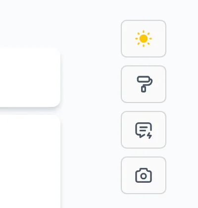
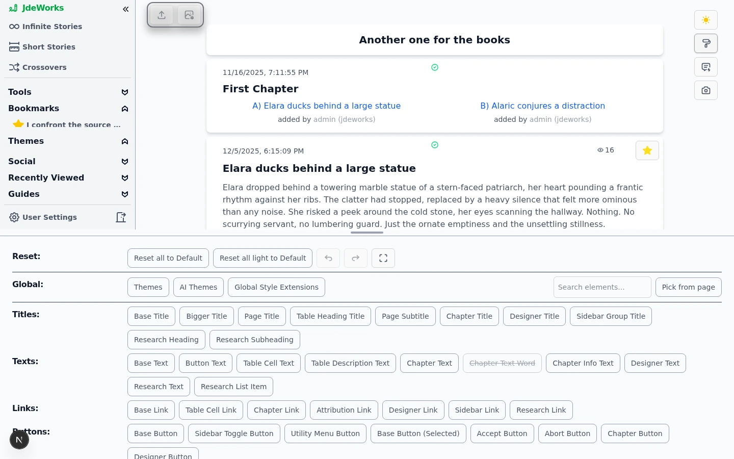
The Designer opens from the paintbrush icon in the utility buttons at the top right of every page. On phones the same action lives in the ⋯ menu as Open Designer. A drawer slides up from the bottom and the app keeps running above it, so every change is visible live. The thin bar on the drawer's top edge drags to resize the split.The paintbrush opens the Designer. The sun icon next to it switches light and dark mode.The drawer starts with a Reset row that also holds the undo, redo and fullscreen buttons, then a Global row with the entries Themes, AI Themes and Global Style Extensions plus the element search box and Pick from page, and below that the element picker: every styleable element sorted into groups like titles, texts, buttons, tables and backgrounds.Every button in the picker is one restylable element. Search and Pick from page find the right one fast.
With roughly 90 elements, scrolling the picker is the slow way. The search box, the hover highlight and Pick from page are covered step by step in the Designer workflow guide .
Elements, properties and modifiers
Open a story so the element you want to change is on screen, then open the Designer.
Click an element in the picker, for example Chapter Title. A short description appears together with section buttons such as Manual Input, Presets and General Design.
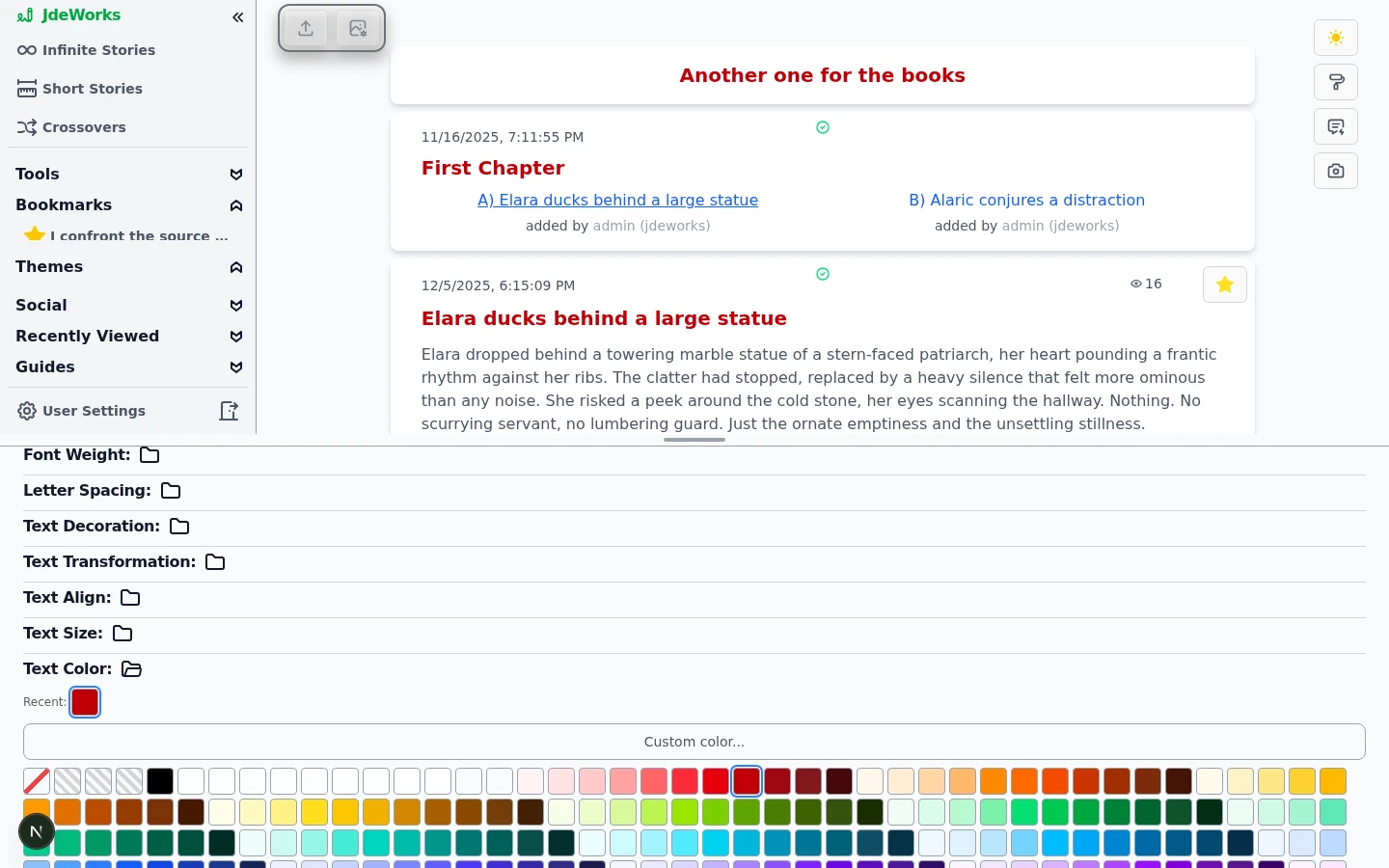
Open General Design and pick an option group, for example the text group. Property rows like Font Weight, Text Size and Text Color unfold.
Click a value. It applies immediately to the live page above the drawer. Colors come as compact swatch grids, so keep clicking until it looks right.
Options apply live. The active value carries a blue ring, and recent colors collect in their own row.Beyond General Design, the Hover Modifiers, Focus Modifiers, Disabled Modifiers and Small Device Modifiers sections style an element only in that state, for example a different color while the mouse hovers it. Small Device Modifiers apply on phone widths only, which is how one theme can look right on desktop and mobile at once. Manual Input exposes the raw configuration for power users.The image elements follow the same Floating and Inline vocabulary as the image placement setting in User Settings : Floating Image Box styles the overlaid image frame, while the Inline Image and Inline Image Box elements style images placed inside the reading column. Style both families if your readers may use either placement.
Experiments are free: undo (Ctrl+Z) takes back any change while the Designer is open, and the Reset row can reset a single element or everything, with a confirmation before the destructive resets. Details in the Designer workflow guide .
Light and dark are styled separately
The app has a light and a dark mode, toggled with the sun icon next to the paintbrush. Each element carries two configurations, one per mode, and the Designer always edits the mode that is currently active.
Style an element in light mode.
Click the sun icon to switch to dark mode. Your light changes stay untouched.
Style the same element again for dark mode.
A saved theme can declare its own preferred mode. Applying such a theme switches the app into that mode automatically.
Saving your look as a theme
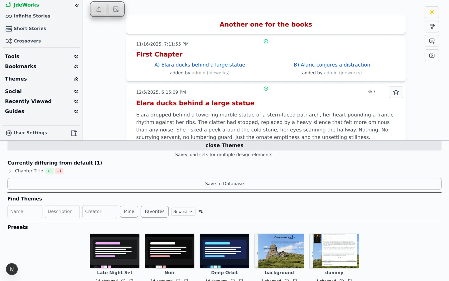
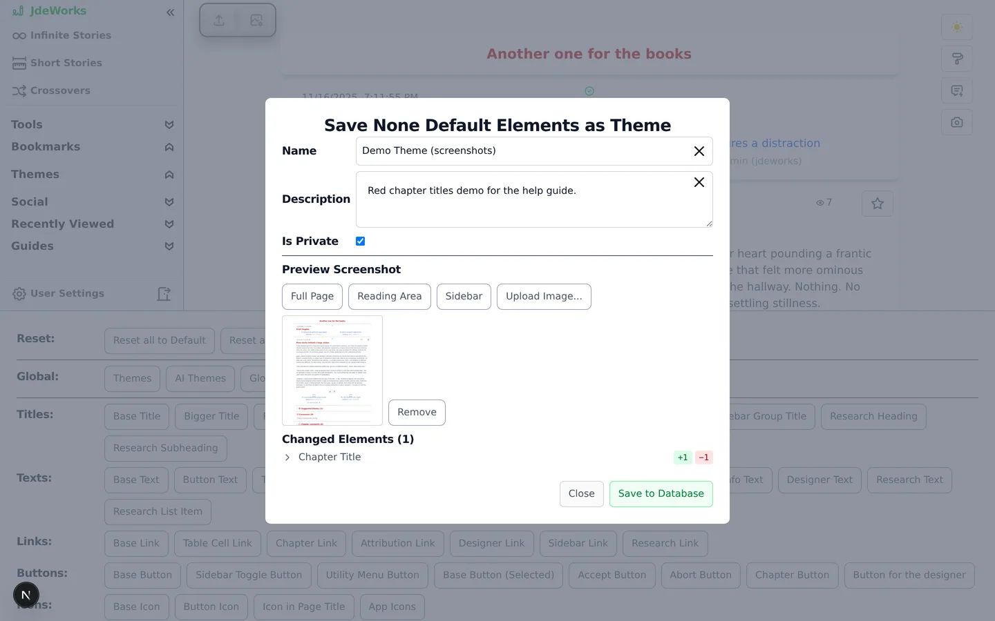
Open Themes in the Designer's Global row. The top of the area lists every element currently differing from the default. Save to Database opens the Save Your Changes as a Theme dialog, which bundles exactly those differences into a theme.Only elements that differ from the default go into a theme.
Click Save to Database. The save dialog opens.
Enter a Name and a Description.
Decide on Is Private. Private themes are only visible to you. Unchecking it shares the theme publicly, which adds a ToS confirmation checkbox you must tick: no illegal or explicit content, nothing copyrighted you lack rights to, no real person's likeness without consent.
Capture a Preview Screenshot with one of the area buttons, or use Upload Image.... A preview is required.
Click Save to Database in the dialog.
The dialog lists exactly which elements the theme will contain.Your own themes show a pencil icon on their card. It opens the Edit Theme dialog for renaming, changing the description, flipping private or public, and Delete Theme.
Applying, favoriting and suggesting themes
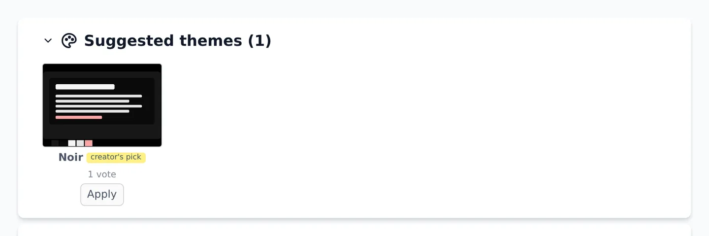
The Find Themes controls in the Themes area search all public themes by name, description or creator, with filters for your own themes and your favorites. Every theme card offers Use Preset to apply it and a star to favorite it. Public themes from other creators additionally offer Clone, which gives you a private, editable copy.Presets also exist per element: the Presets section of a selected element lists saved looks for just that element. Use Preset applies the single-element look, and when a preset row comes from a shared theme, Use Theme applies that whole theme instead.Favorited themes appear as a Themes group in the sidebar. One click there applies the theme from anywhere in the app, without opening the Designer.While reading, a Suggested themes section can appear above a story or chapter. Readers recommend fitting themes there: Apply tries one out, Suggest your current theme and Suggest a saved theme... let you recommend your own picks to others, with a private preview before you commit.Community suggestions per story. Apply is always just a preview for you.Two rows across two tabs in User Settings control this: on the Reading tab, Theme suggestions shows, collapses or hides the section; on the Images tab, Auto-apply suggested theme can automatically preview the top suggestion while you read, either the creator's pick only or anyone's top pick. The auto-applied look is an overlay. It never touches your saved styling and disappears when you leave the story.
AI Themes and Global Style Extensions
The AI Themes entry in the Global row has two tabs. Recommend ranks the existing community themes for your current story, optionally steered by a short direction like cozy slice-of-life, and lets you apply any recommendation directly. Generate builds an entirely new theme: give it a direction like moody gothic horror, and it designs a concept, styles the elements and can add fitting background photos. You can save the result as a theme, and on a story page you can suggest it to other readers right away.Recommend uses the language-model provider selected in your settings. A backend run uses text credits , while a correctly configured bring-your-own provider uses that provider instead. Generate always uses the server-selected models and bills the concept, photo-ranking and design stages separately. Its live estimate is shown before you start. Retrying a failed stage bills that stage again, while Continue without photos skips the photo-ranking stage when it has not already run.Generating a new background image from an individual image slot is a separate image-credit action. Choosing an existing Pexels photo does not generate an image. A pasted image or icon URL loads from its third-party host, which reveals a network request to that host and can fail when its access rules or the app's security policy block it.Global Style Extensions, the third Global entry, holds styling that applies app-wide instead of per element: custom CSS additions and the eight shared user color slots that custom colors are built on. Themes can include these too, which is how a saved theme carries its exact custom shades.
Best practices
Start from an existing theme with Use Preset and adjust the few elements you care about. That is much faster than styling every element from scratch.
Style both modes before saving: switch with the sun icon and check every changed element in light and in dark.
Check the Small Device Modifiers of your key elements before sharing a theme. Half your audience reads on a phone.
Favorite the themes you switch between. The sidebar Themes group applies them with one click, no Designer needed.
Pick a preview screenshot that shows your theme's strongest area, for example the reading view. The preview is what everyone sees in theme lists.
Under the hood
All styling lives in your browser's localStorage, per device, with separate light and dark configurations per element. That is why changes apply instantly and why two devices can look completely different.Most elements inherit from a base element (for example every title from Base Title). The Designer edits the specific element and records which inherited values you replaced, so defaults and inheritance keep working underneath your changes.State-dependent styling (hover, focus, disabled, small devices) is stored as modifier lists and rewritten at runtime into real CSS pseudo-class rules that are injected into the page head.A saved theme contains only the elements that differ from the default. Applying a theme merges those differences onto the defaults instead of replacing everything, so app layout and future default improvements stay intact.Themes are stored on the server with their preview image. They are private by default, sharing publicly requires a Terms of Service confirmation, and cloning someone's public theme creates a private editable copy with a fresh confirmation recorded.AI theme Generate runs server-pinned concept, optional photo-ranking and element-design stages that each bill as a text-credit task. The live estimate comes from public credit info. Retrying bills only the repeated stage. Recommend follows the selected backend or bring-your-own provider, and manually generating a new background is a separate image-credit task.